Micasa
Micasa was a project that I worked on in 2021, after being asked to assist on the branding and application design of a product that aimed to make home management easier. There are many different aspects to owning property - from the buying process, across maintenance and eventually selling. Micasa aimed to make this easier by creating a connected system that would track your homes health across various aspects.

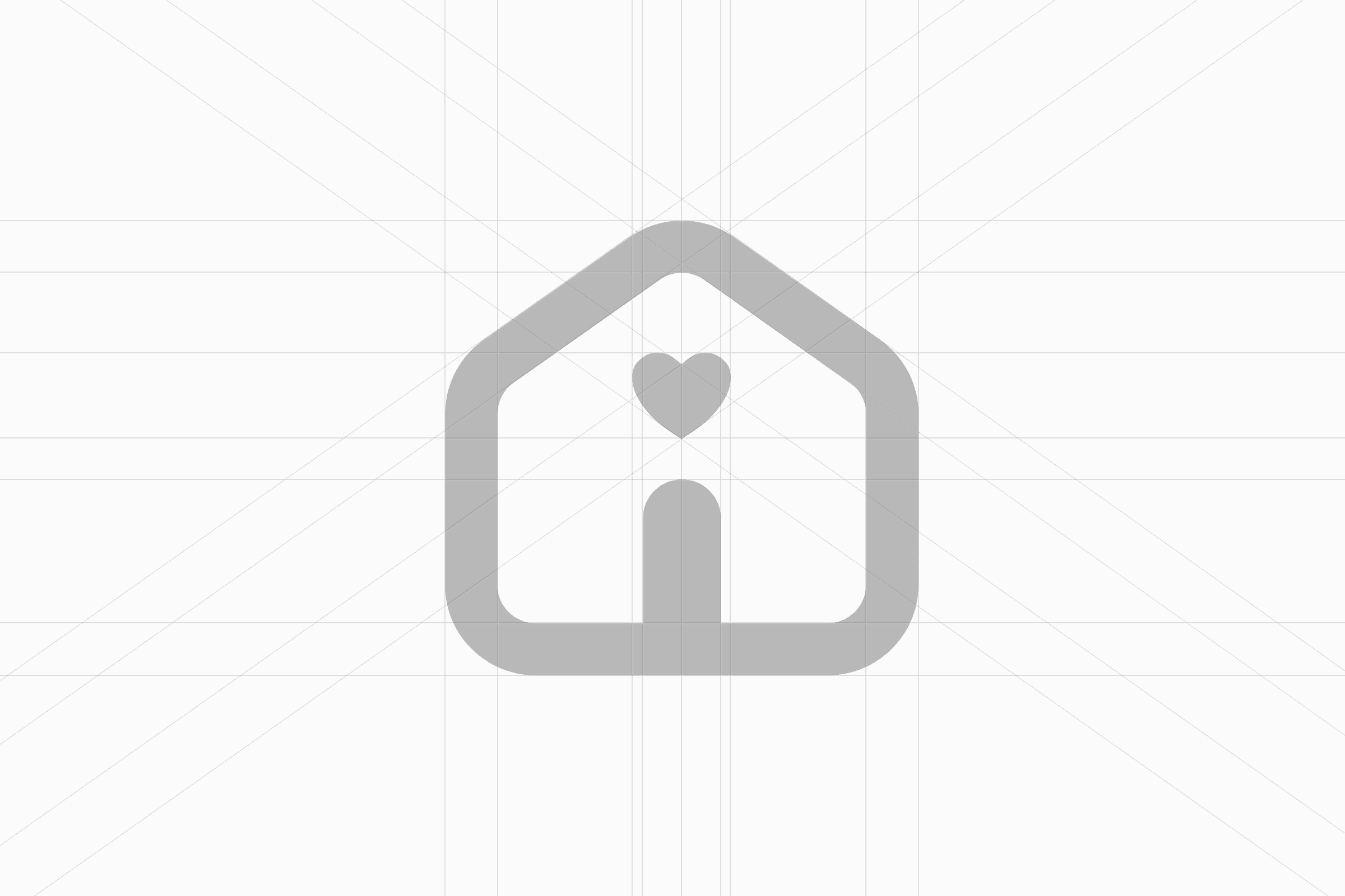
The main motif that went into the brand icon was the typical house silhouette, combined with different metaphors for health, or in the last option document keeping. The final design actually came from the founders daughter, who did a quick pencil sketch as her way of contributing to our explorations, placing a heart as a dot above the houses doorway. We loved it immediately. It's is smart because of the dual representation: it retains the home aspect of the symbol, while subtly adding health the closer you look. But it also starts to shape as an 'info' icon, with the heart dotting the 'i', which is to the point as the experience is facilitated by keeping track of your homes information.


I worked on illustrations for the various facilities/elements of a home that may need keeping account of. From insulation, to ovens and appliances, through to plumbing and windows. These needed to be simple and because of the bespoke nature of some of the icons, it was hard to find a public icon set out there in the wild that had a unified aesthetic. I took to designing my own.

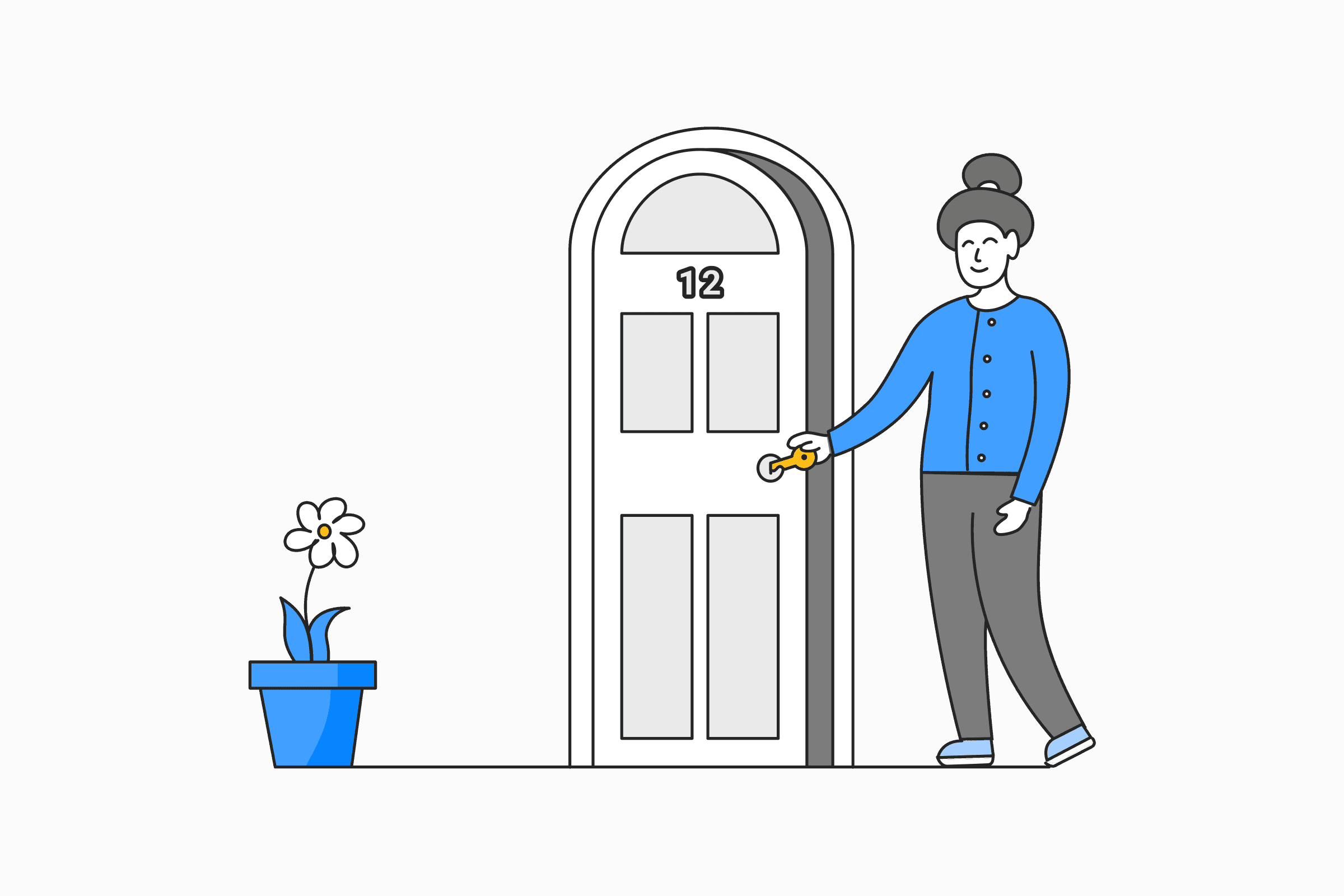


To help add more personality and brand presence, we used illustrations to accompany the various parts of the application and onboarding process. The style aimed at making the task feel more approachable and friendly.

I was responsible for designing the full stretch of software, from initial onboarding through to the home management tool itself. The following is a series of captures of those aspects, from setup, to the initial MVP. And while the startup didn't take off due to funding issues, I'm still proud of the work we put into it.


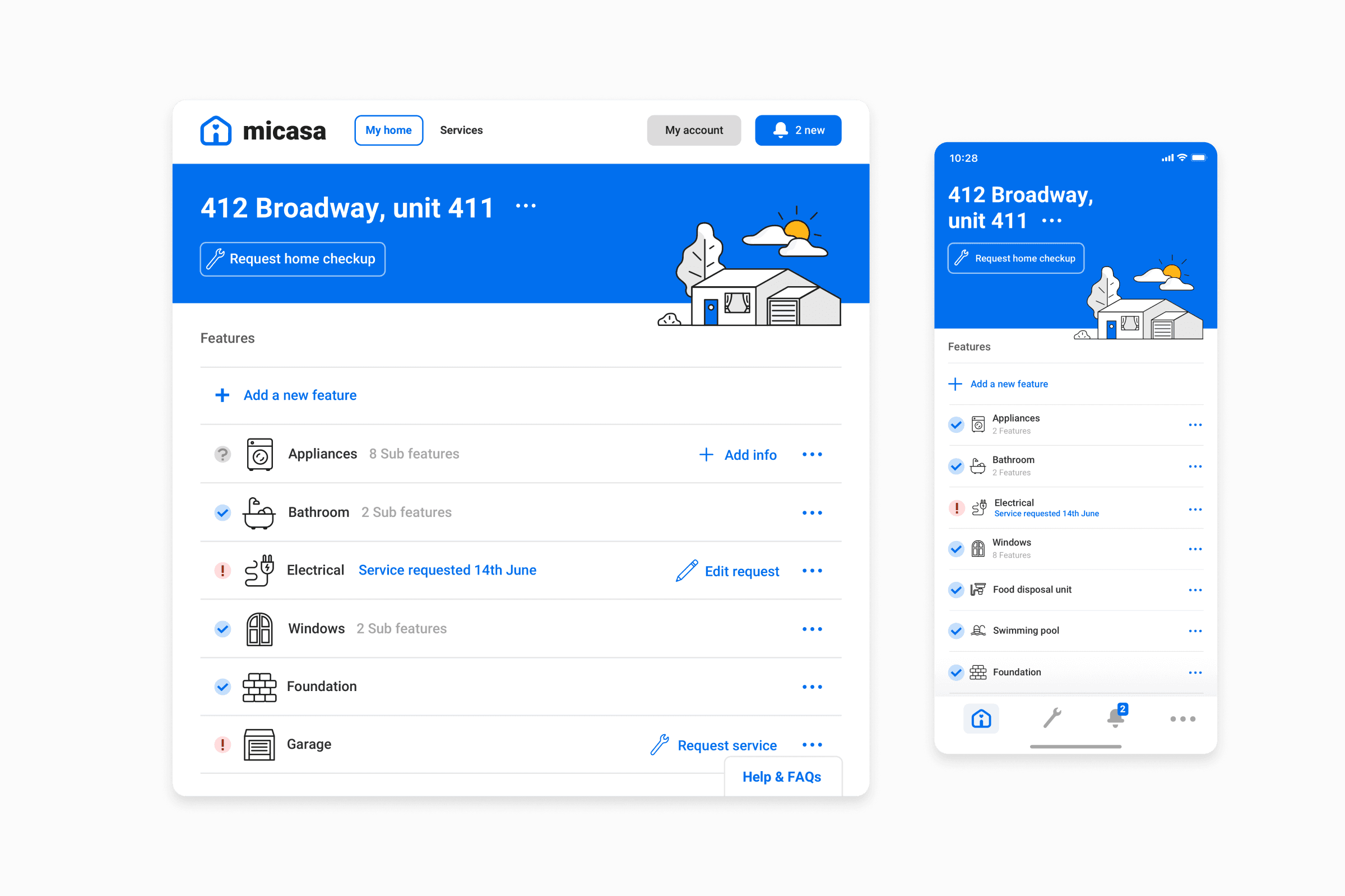
The core view of the application sought to give an overview of your homes features, letting you know when service is recommended and helping connect you to providers that can help.
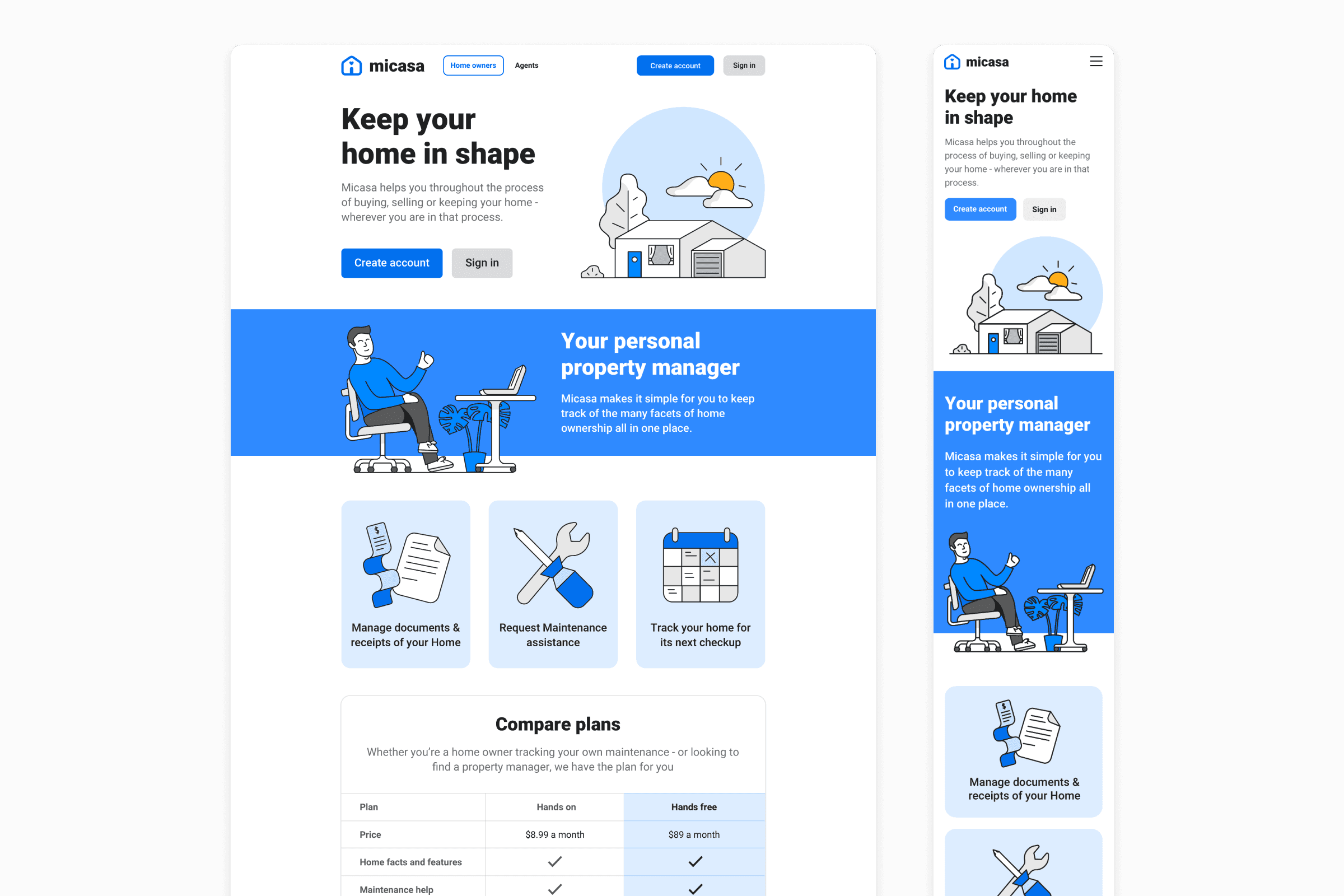
The home page came in two forms… one for home owners, and one for agents who would leverage the home tracking information, and client communication to help them in the selling process.
